Chick-fil-A
Play Brand Refresh
OVERVIEW
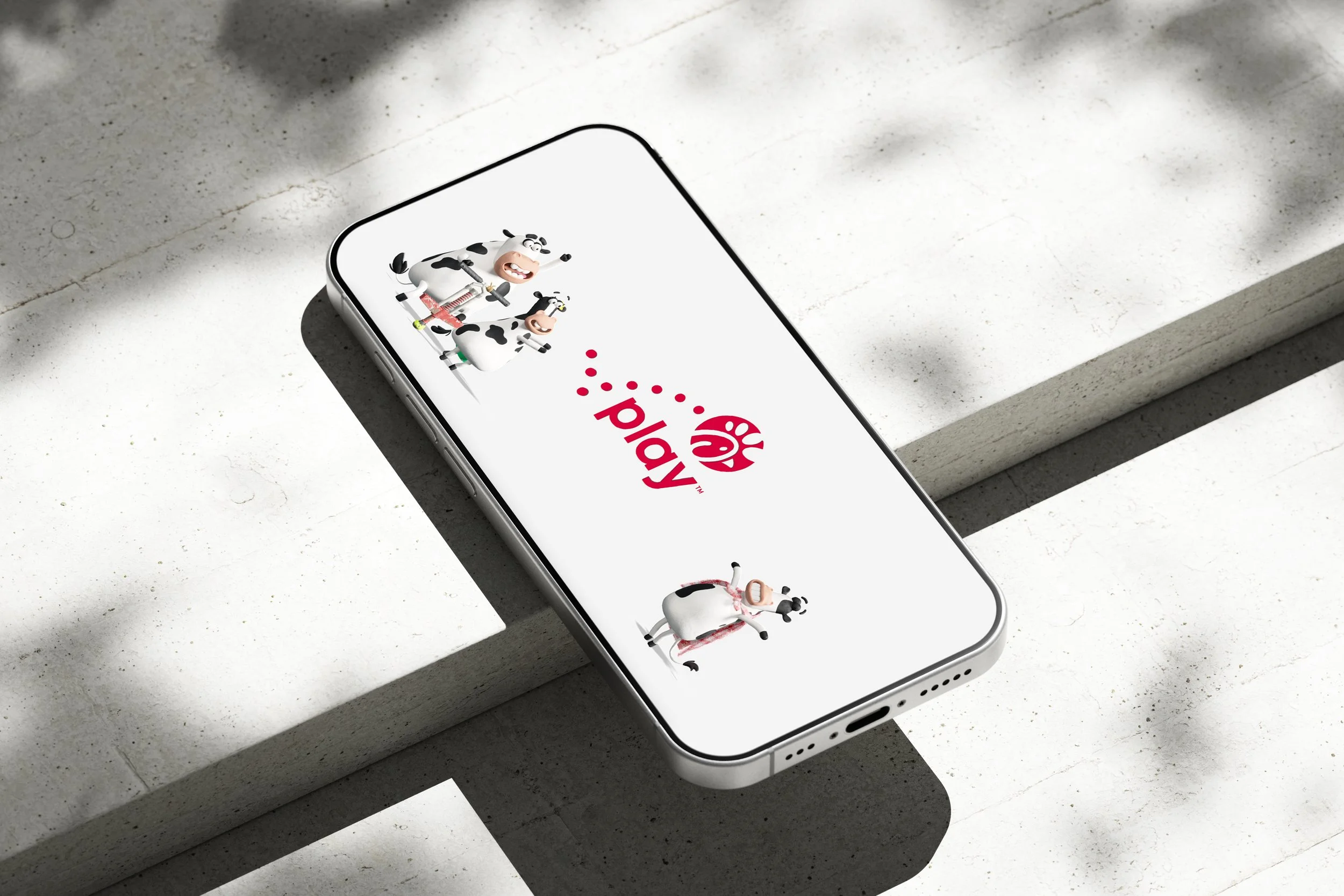
The Chick-fil-A Play logo refresh refined an existing sub-brand mark to create stronger alignment within the company’s broader visual identity. The updated logo features adjusted color, improved balance, and a refined dotted check for greater symmetry and scalability. Alongside the redesign, I developed logo usage guidelines and a custom container shape to maintain clarity and consistency across applications—from Kids bags to printed books.
ROLE
Led the redesign of the Chick-fil-A Play logo and supporting standards; refining color, proportion, and the dotted check for balance and scalability. I also developed comprehensive logo usage guidelines and a custom container shape to ensure clarity and brand integrity across Kids packaging, books, and other playful brand environments.