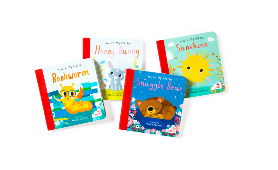
Led the evolution of the Chick-fil-A Kids identity into Chick-fil-A Play identity system. Refining the primary logo to better align with the brand’s broader visual system. The work included updating color, proportion, the dotted check, and introducing a custom container shape to bring clarity, consistency, and scalability across Kids packaging, books, and playful brand environments.
CONTRIBUTION
LEAD BRAND IDENTITY DESIGNER
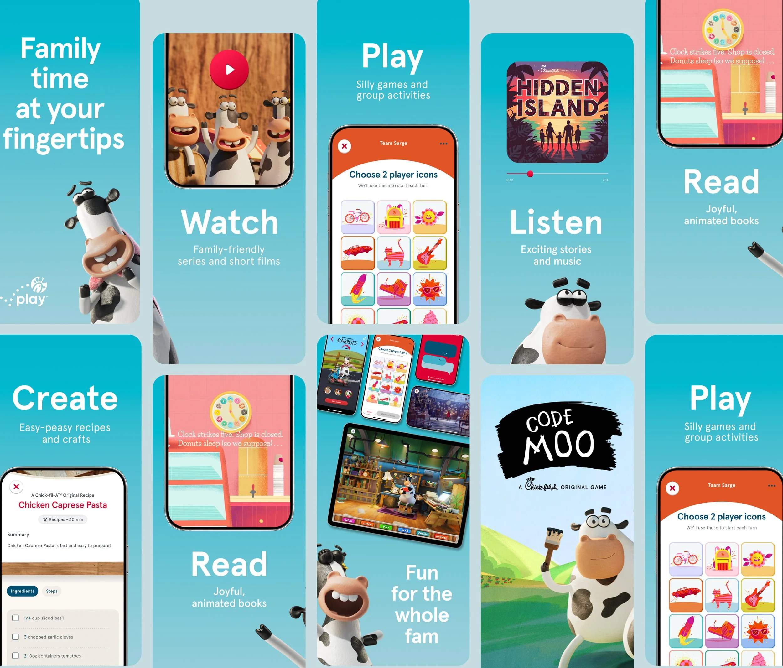
Our goal was to strengthen how Chick-fil-A Play lives within the larger brand ecosystem while preserving the warmth and joy that define the program. Central to that goal was transforming the logo from a standalone mark into a flexible system. The container shape became a unifying device—providing a consistent framework for expression, improving legibility across formats, and giving teams a clear, repeatable way to apply the identity at any scale.
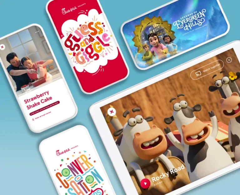
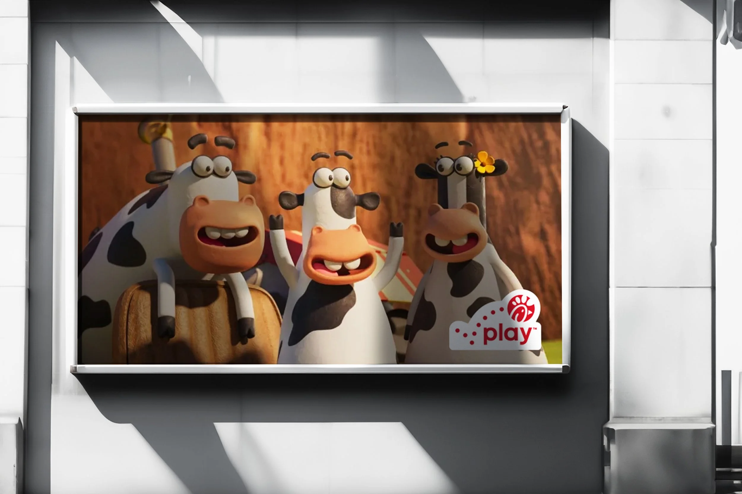
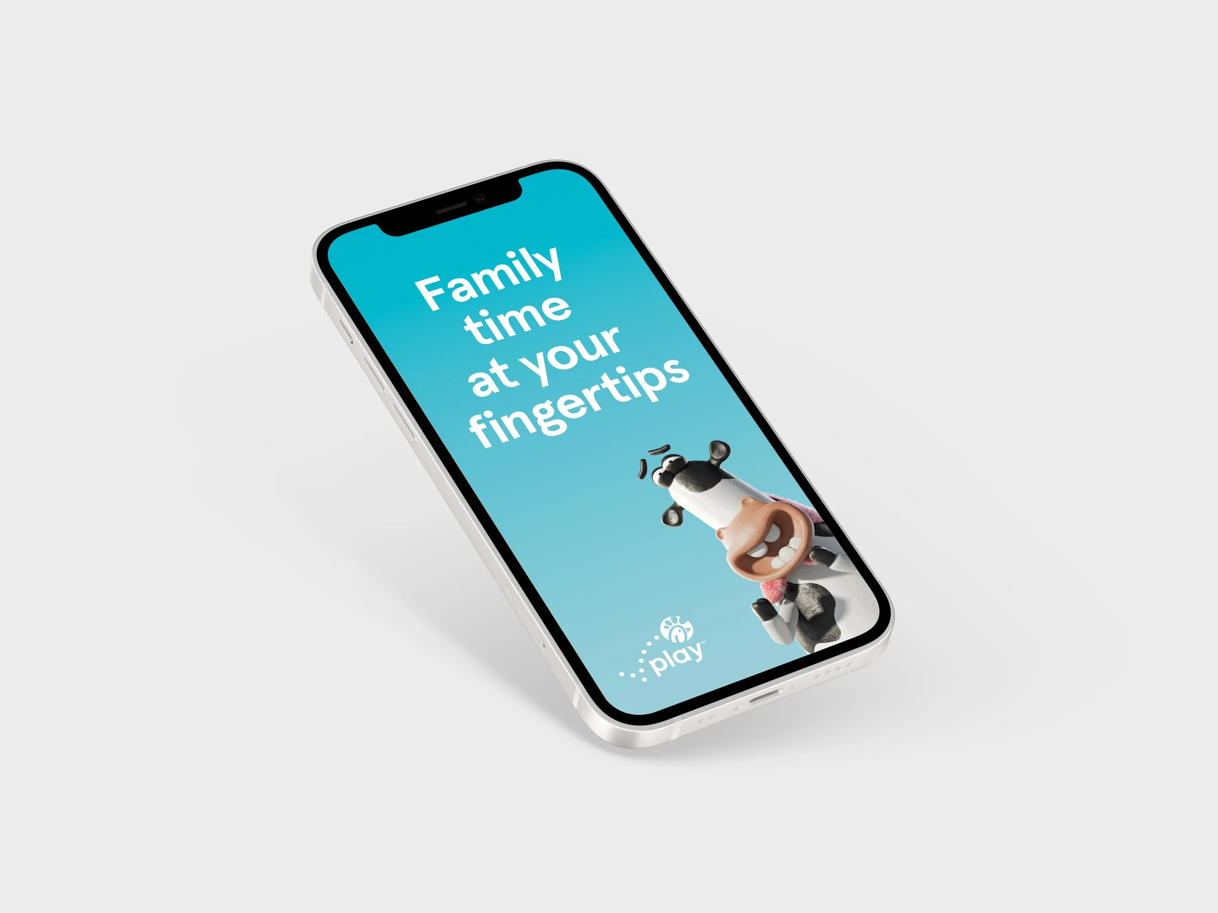
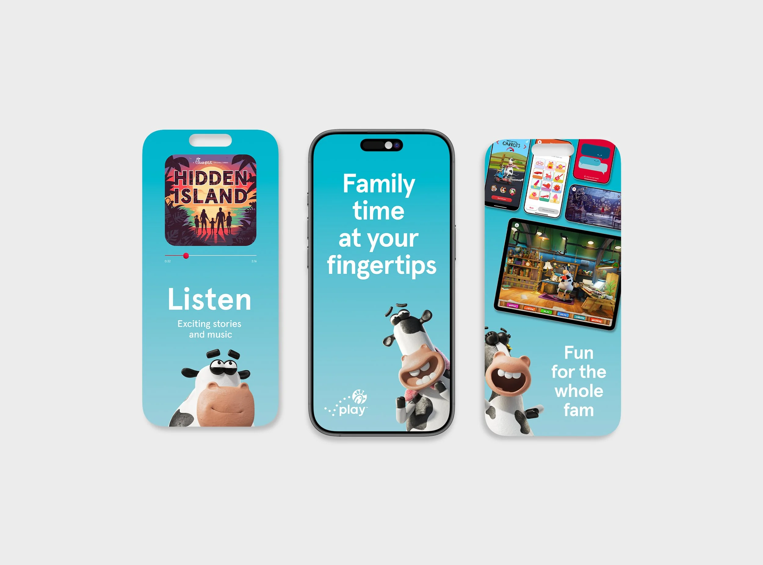
Launching the updated Chick-fil-A Play logo means the system is now active across products and experiences that reach families every day. The refinement unifies how Play appears in market while maintaining its spirited character—supporting brand cohesion at scale and giving internal teams a clear, flexible framework for consistent expression.